Branderah created a complete brand identity for Tuneup, combining motion-inspired visuals, a warm athletic palette, and versatile typography to position the brand as a trusted wellness destination for everyday athletes.
Tuneup is a Canadian wellness brand designed for everyday athletes. They curate high-quality essentials that support movement, recovery, and performance while fitting seamlessly into busy lifestyles. Built on humble beginnings and intentional hustle, Tuneup reflects a modern, purposeful approach to wellbeing.
The brand values accessibility, consistency, and community, helping people stay active, balanced, and energized through daily life.

Tuneup approached Branderah during its early launch phase with a clear mission. They needed a powerful visual identity that would communicate their purpose, stand out in the Canadian wellness market, and scale across packaging, merchandising, web, and retail touchpoints.
The brand required a system that felt active yet grounded, modern yet timeless, and expressive of everyday athleticism without leaning into overly intense or high-performance stereotypes.

Our strategy focused on clarity, movement, and adaptability. We built a visual identity system that blends lifestyle and performance, allowing Tuneup to position itself as a trustworthy, community-driven brand that supports the daily athlete.
Key priorities included
• A recognizable primary logo
• A flexible brand mark symbolizing movement
• A modern, functional colour palette
• Clean, readable typography for digital and print
• Visual consistency across brand and product environments
We developed a logo rooted in fluid motion and upward momentum. The final icon features curved forms that mirror movement and recovery, paired with bold typography that reinforces strength and reliability.
The approved logo reflects this balance perfectly.
It supports both full-brand lockups and standalone icon use, ensuring maximum versatility across brand assets.
Tuneup’s colour palette was crafted for warmth, confidence, and modern sophistication. We introduced three core colours
• Gunmetal
• Caput Mortuum
• Peach Yellow
This palette brings contrast and emotional depth, while remaining neutral enough for e-commerce, packaging, and editorial layouts.
We selected a dual-typeface system to balance personality and function.
• Poppins serves as the bold, modern primary typeface, perfect for headlines and brand statements.
• Inter supports body copy with clean readability for digital experiences.
Together, they create a polished, accessible visual language that feels contemporary but approachable
Using the brand’s icon, we created seamless patterns that enhance packaging, merchandising, and social content. These show how these motifs add rhythm, movement, and brand recognition without overwhelming layouts.
These patterns scale across digital and physical applications, adding depth to the visual system.
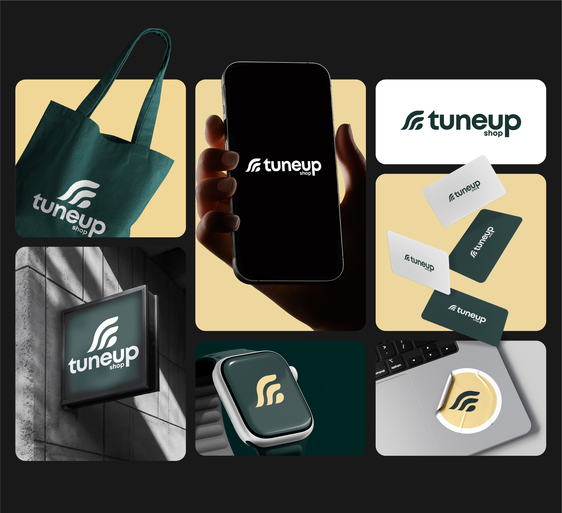
To bring the identity to life, we produced a suite of mockups showcasing
• product packaging
• apparel and bags
• signage
• digital interfaces
• stationery
These visuals helped Tuneup see the full power of the brand identity and created consistency across every touchpoint ahead of launch.

With a complete brand identity and guideline system, Tuneup is now equipped to enter the wellness market with clarity and confidence. The cohesive visual direction has become a strong foundation for their e-commerce experience, marketing, content strategy, and future product line expansion.
The final brand system empowers Tuneup to
• stand out in a competitive space
• communicate purpose with every interaction
• build a strong community of everyday athletes
• scale consistently as the business grows
• Brand Strategy
• Logo and Identity Design
• Colour and Typography System
• Pattern and Visual Language Development
• Brand Guidelines
• Branded Mockups and Launch Assets
Tuneup now has a strong, scalable visual foundation that elevates their presence across digital, retail, and product touchpoints. The brand can confidently launch, build community, and stand out in the Canadian wellness market.
If you are building or refreshing your brand and want an identity that feels intentional and market ready, we can help.
Book a consultation with Branderah to get started.

Reach out today — we’d love to hear from you! Let’s bring your vision to life.